I am Liam Coxon, a product designer.
I get my kicks by crafting clarity.

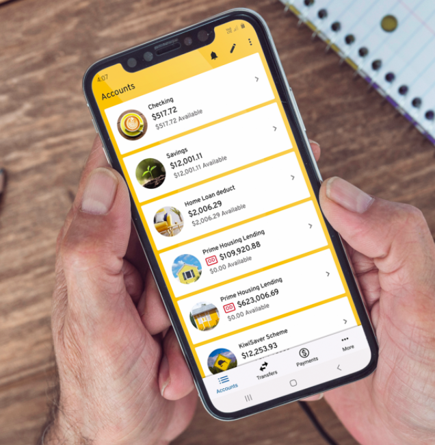
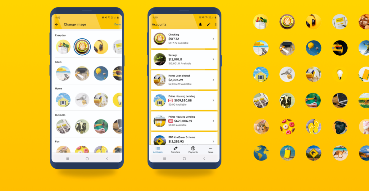
I worked on several concept phases of this mobile app redesign project with the team at Isobar. Starting out with extensive research we developed over 100 different concepts, whittling them down through multiple rounds of internal and stakeholder feedback. Eventually we settled on this concept which went on to be developed further by ASB and Datacom.
My experience working with material design at Google, along with the ideas for custom account imagery and light/dark modes helped this concept become the winning candidate.
Nominations:
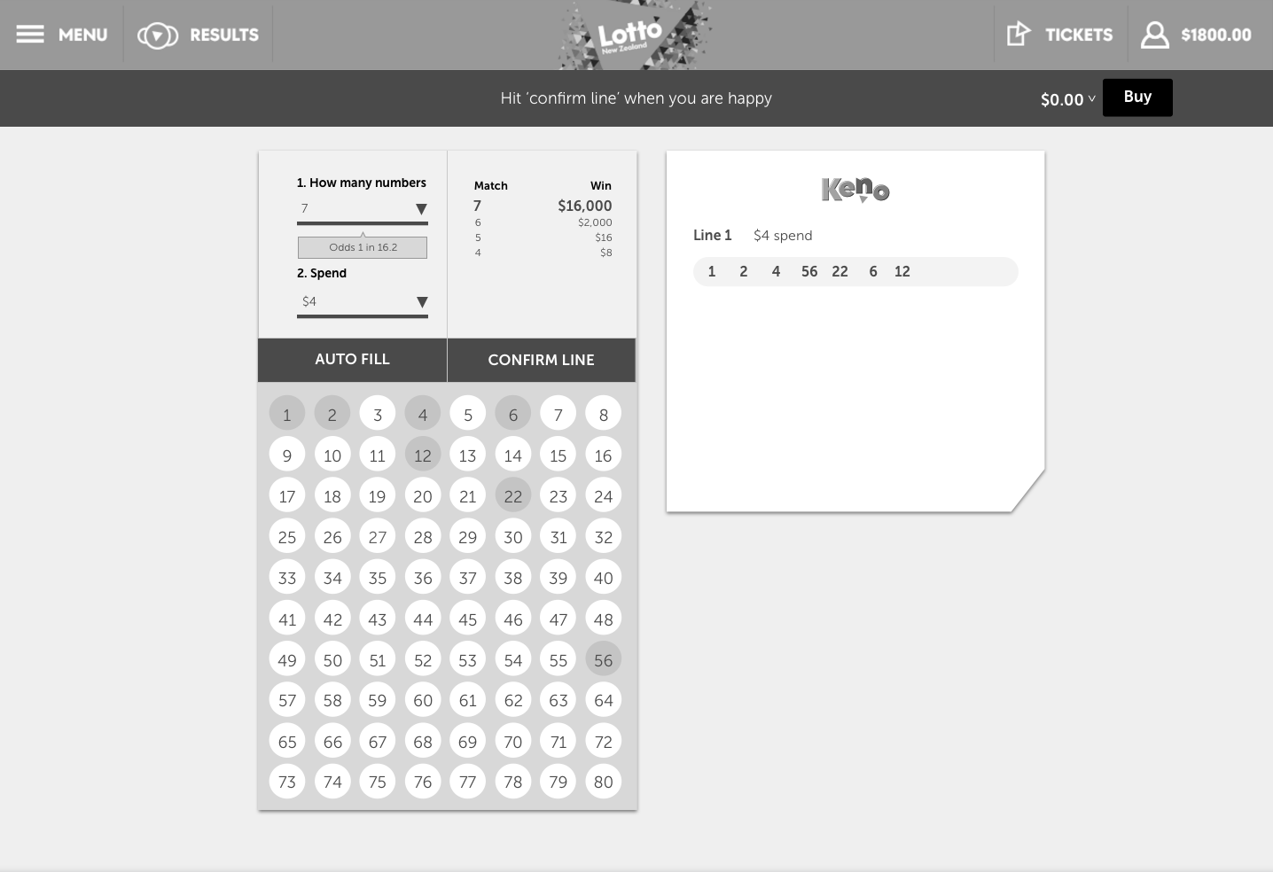
We were asked to totally overhaul Lotto NZ's ecommerce gaming system. I was a key part of this project, bridging both the UX and design teams – starting from the discovery phase, seeing it all the way though wireframes, design and testing.
There were some unique challenges with this vast project. Primarily, in converting a range of decades-old pen and paper games into a modern mobile-friendly format. We had to appeal to a younger app-centric audience, while bringing traditional desktop players along for the ride. Simultaneously, we were asked to create a fresh new design system to encompass Lotto's new brand identity.
In the year after the new app and web experience launched, sales went up by 64% through these channels compared to the previous year.
Work done for Touchcast
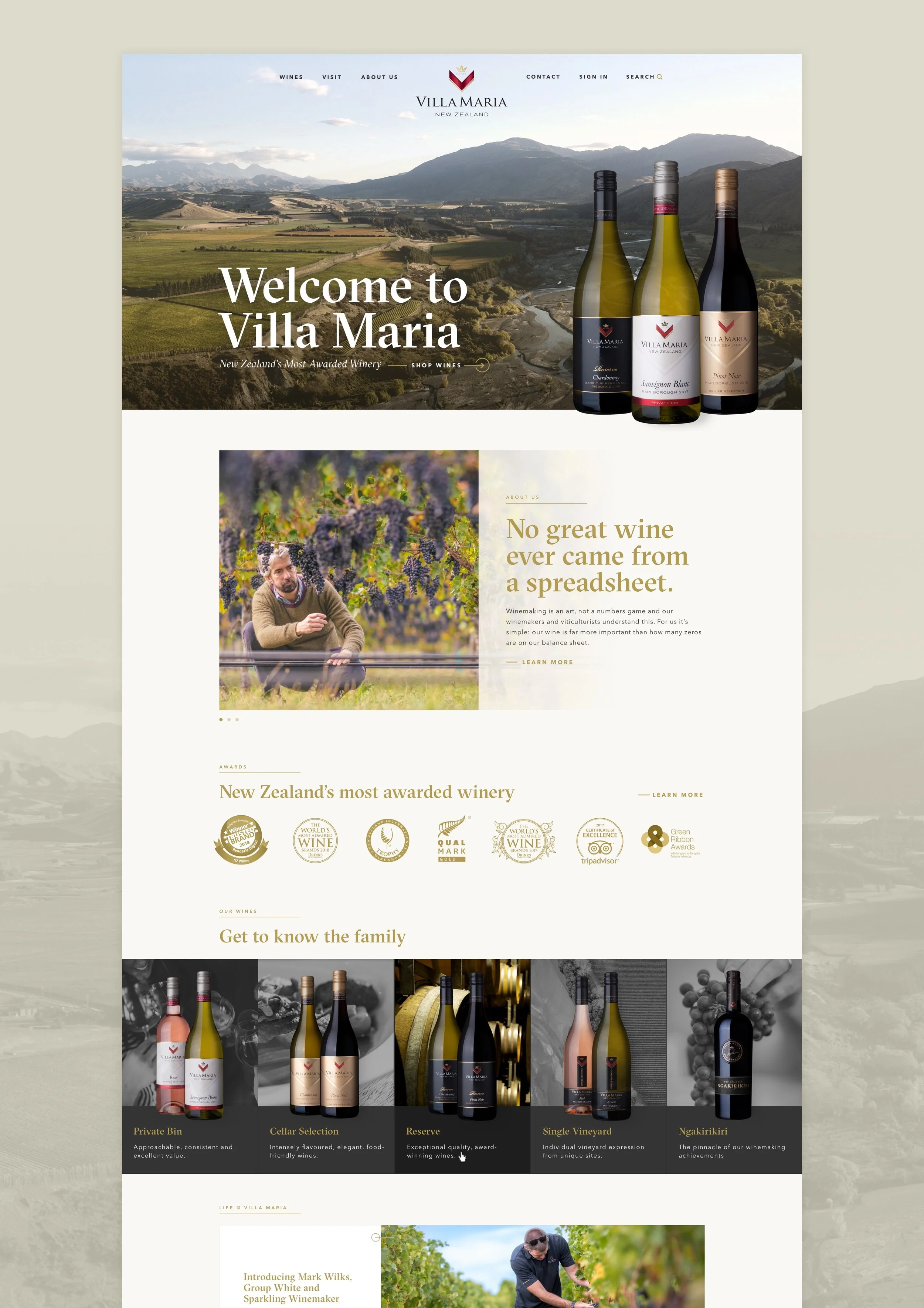
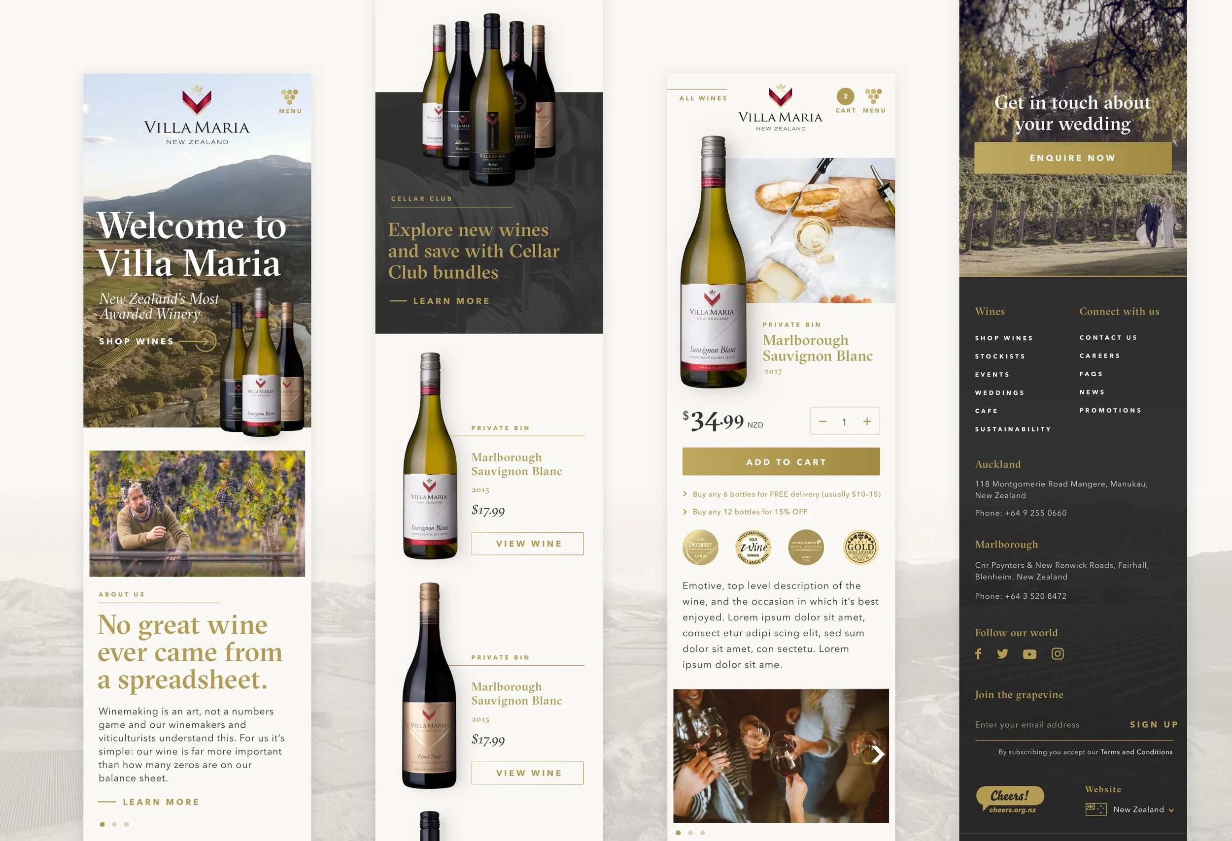
Responsive ecommerce website for Villa Maria Wines. This large ecommerce site was designed with a modular templated approach so the client can edit and add new pages at a moments notice.
Work done for Little Giant
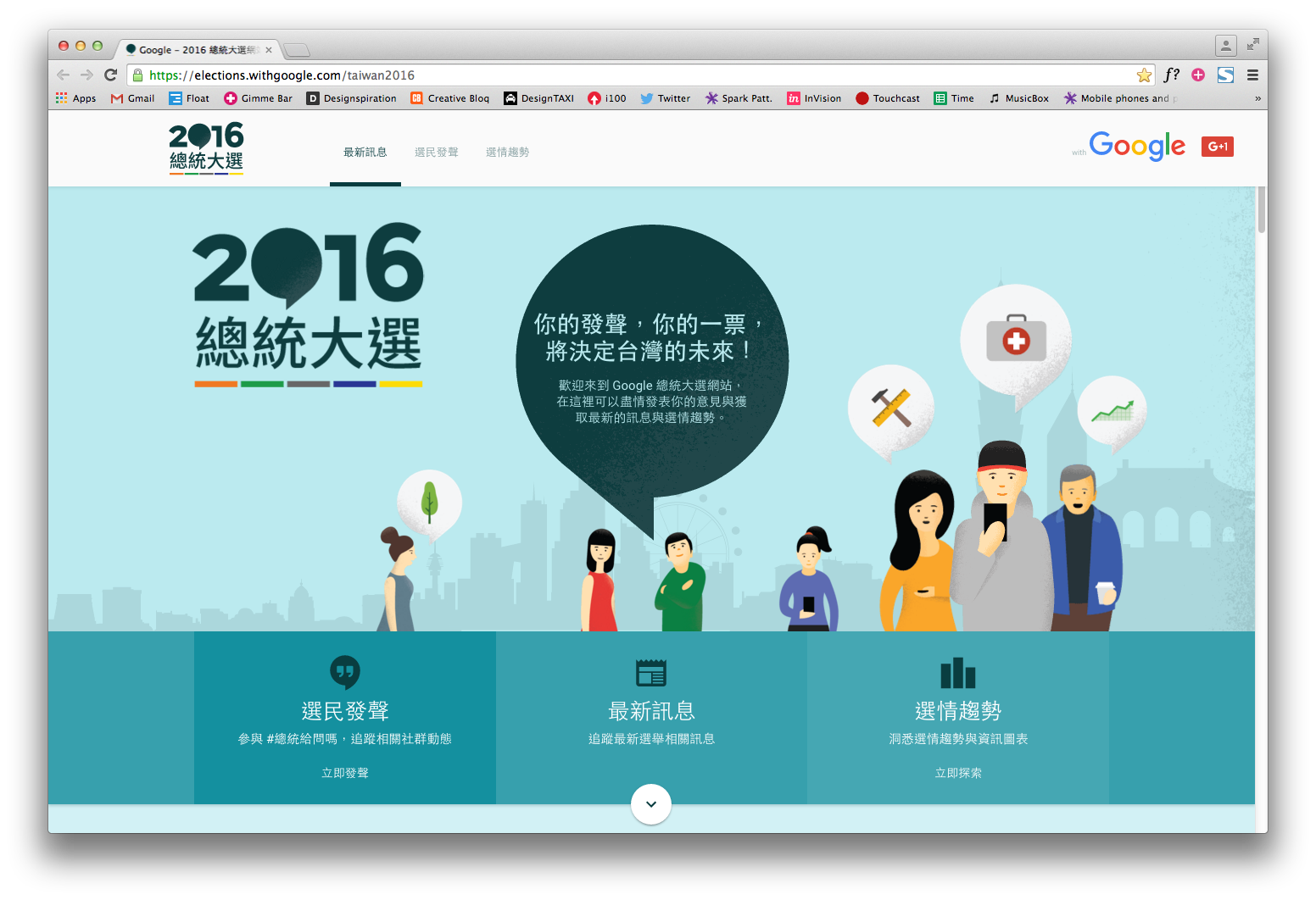
Google challenged us to make an all encompassing election platform for Taiwan’s 2016 Presidential Election. I was the lead UX and UI designer on this Toaster project, and assisted in developing the fun identity.
Voters were able to ‘Ask the Candidate’ via a sweet gadget – they could submit and vote for questions to be put to the presidential candidates. In addition, the fully responsive site provided easy access to a myriad of content and live debates.
The site far exceeded expectations, reaching 18 million Taiwanese voters and 1 in 3 of all youth voters.
Awards:
D&AD Impact Award | Wood Pencil / Communication & Interaction / 2016
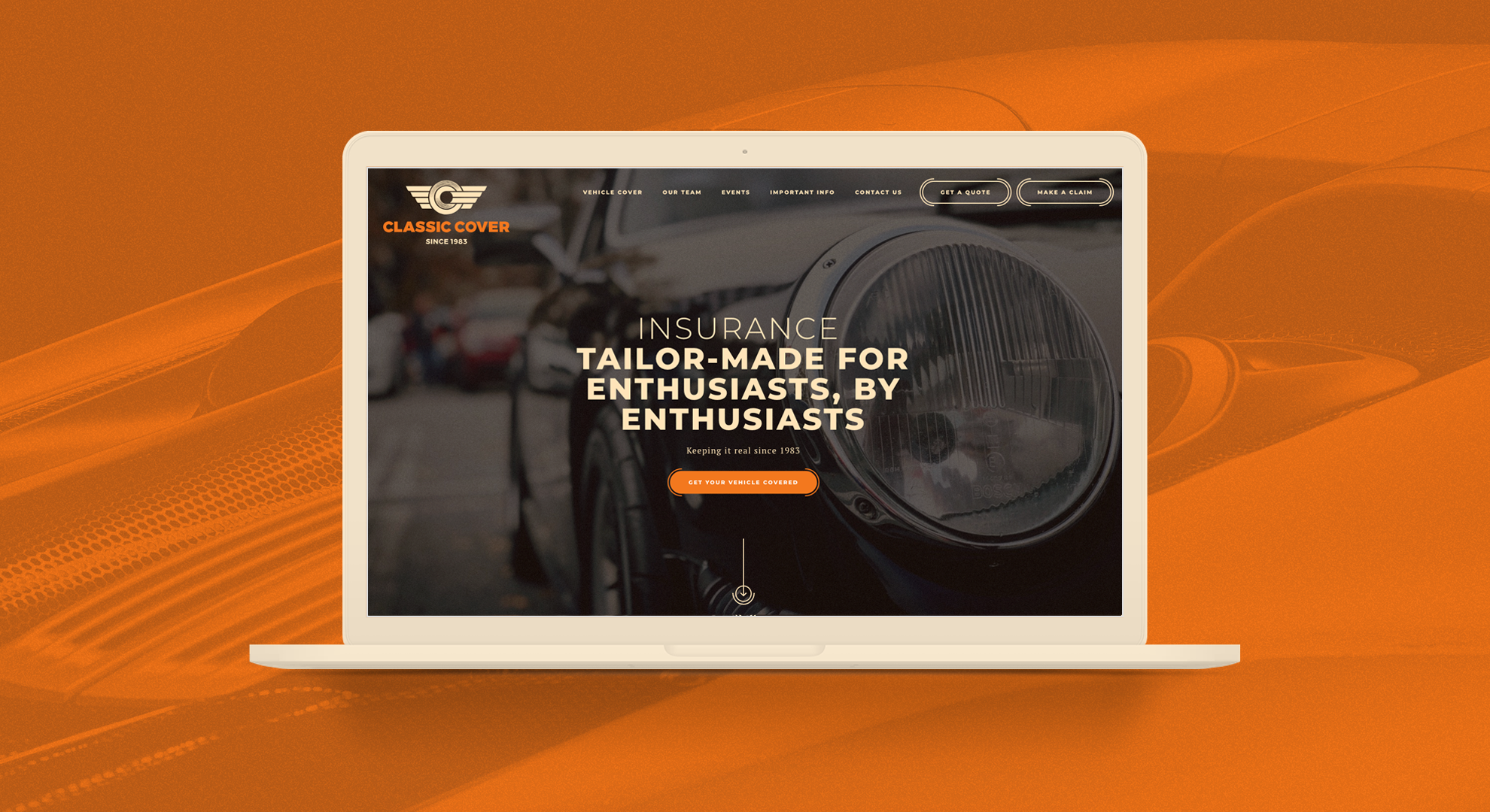
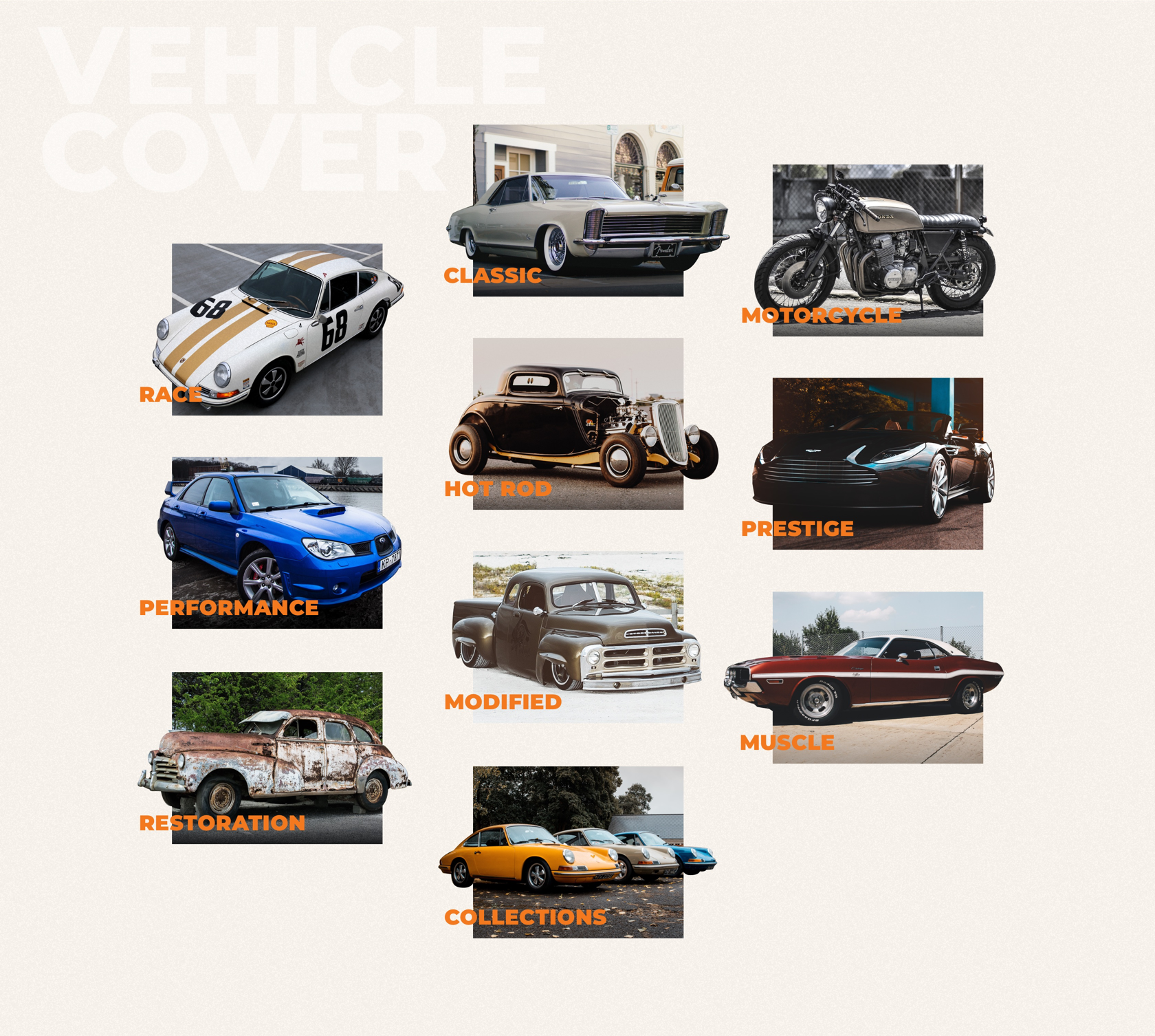
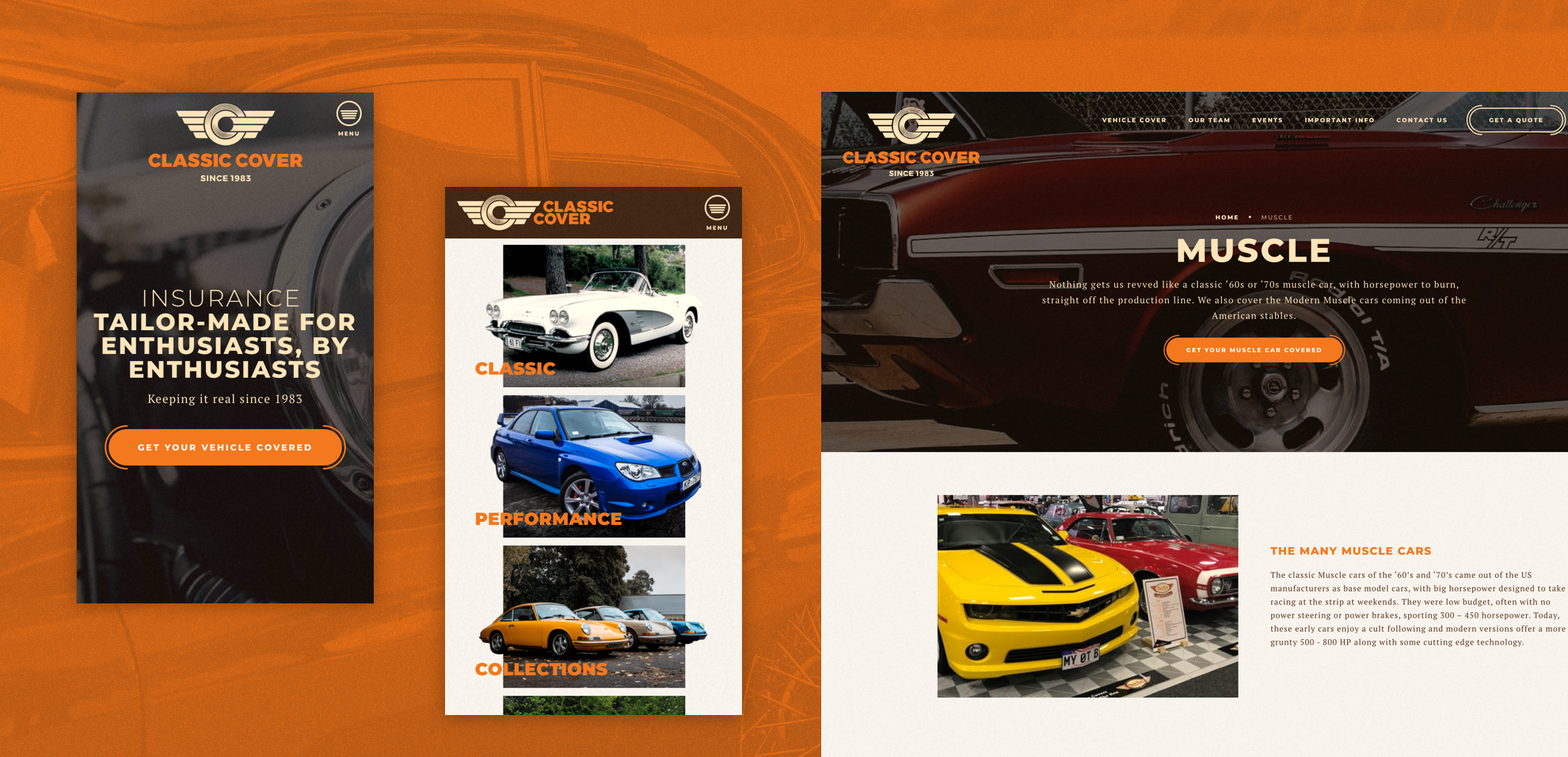
I designed the UX and UI for this responsive website for classic car insurance company Classic Cover. Taking their new brand as a starting point, I rolled it out across the website. The result is a modern digital experience with a retro flavour, that speaks to a wide variety of car enthusiasts and shows Classic Cover’s passion for everything automotive.
Work done at Liitle Giant
Arizto engaged us to design and build an entirely new product and manage its launch to market. We took a human-centred design approach, highlighting and addressing key pain points within the traditional real estate framework to build a superior, tech-enabled customer experience fit for the digital age.
This experience needed to deliver real benefits to both sellers and real estate agents, encompassing self-service tools allowing for enquiry, listing, marketing and then managing the sale of a property.
As lead UX/UI designer, I led a small team to design the responsive marketing site, a full suite of self-service tools and a seperate app for agents.
Work done at Liitle Giant
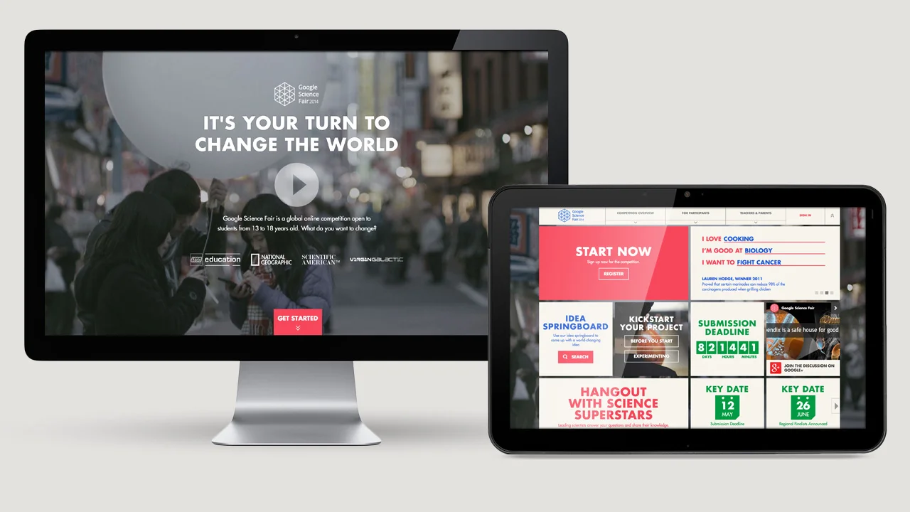
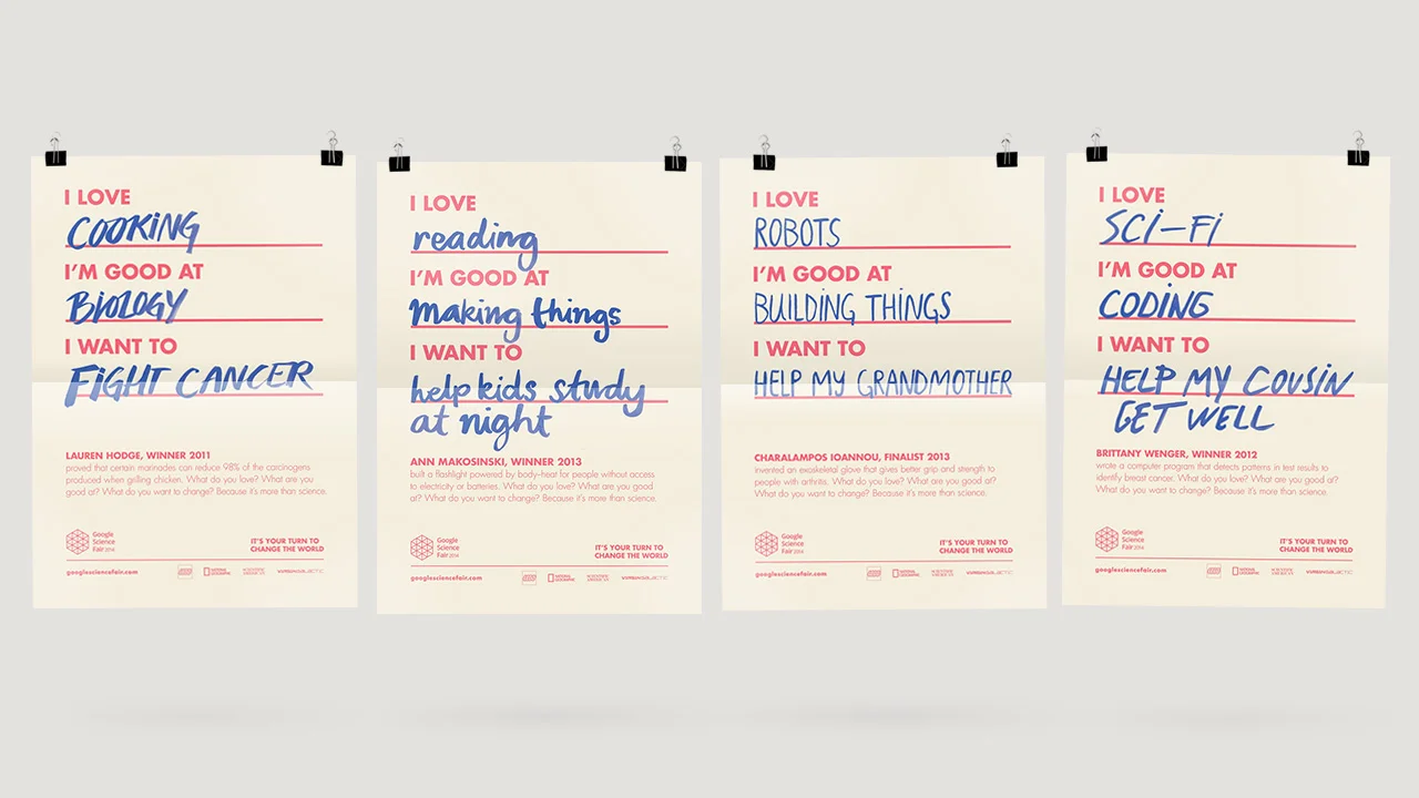
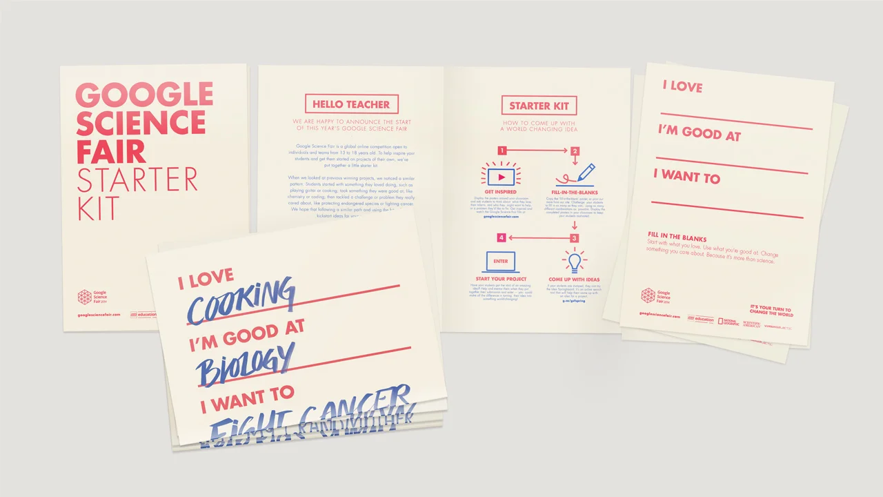
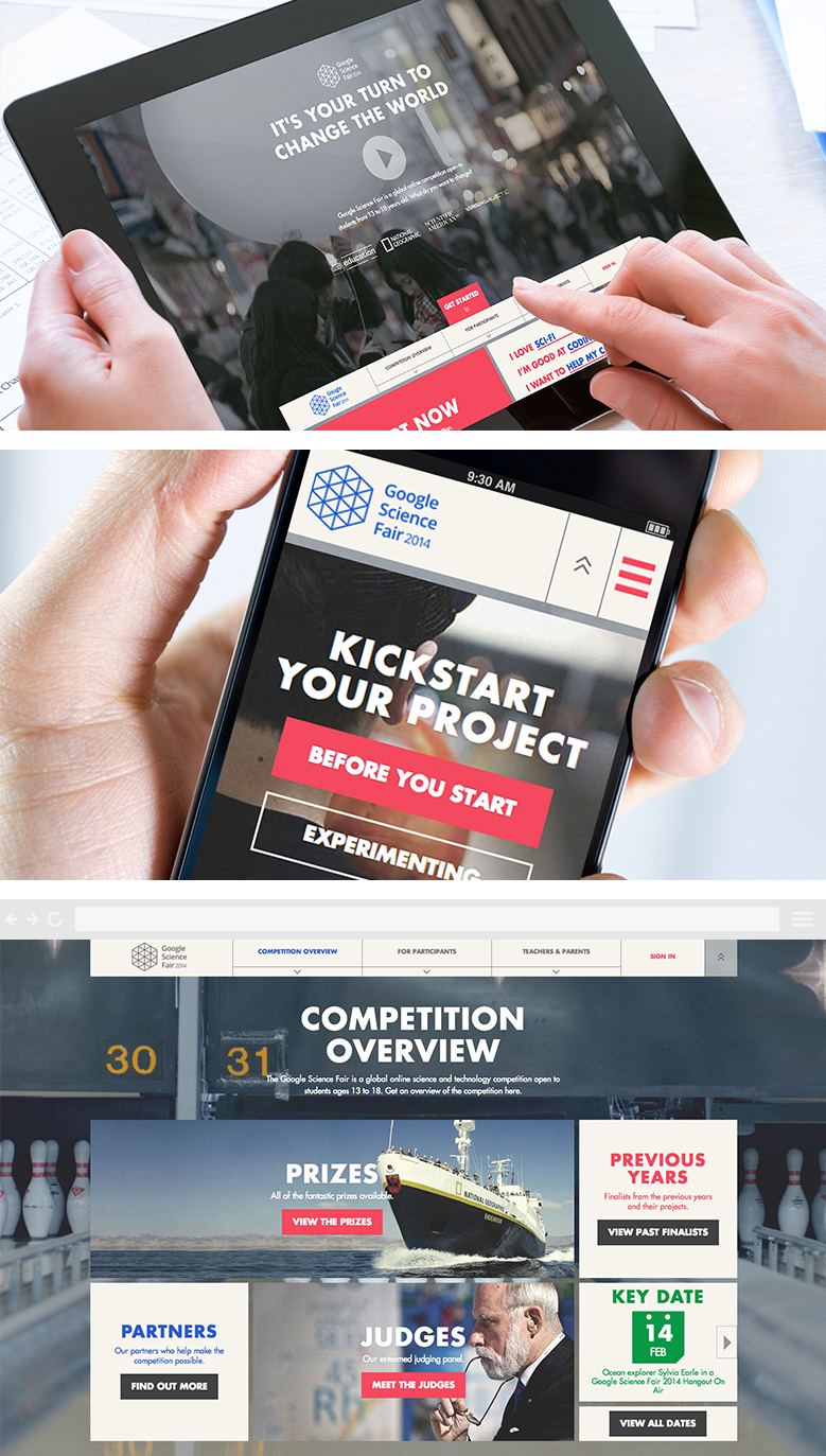
I was one of the lead digital designers working on this global online science competition for students aged 13 – 18. Alongside my awesome colleagues at Toaster and Google Creative Labs we produced a fully responsive website, posters, digital displays, social channels, swag and a distinct visual identity.
The results? Submissions up by 220% on the previous year.
Awards:
Cannes Lions '14 | Shortlist. Promo & Activation: Digital & Social
There is a weird Venn diagram out there – vexillology on the left, classic F1 helmet design on the right, and I, Liam, am smack bang in the middle.
I pine for a time where a driver’s helmet was as recognisable and unchanging as a national flag. The 1998 F1 season, a personal favourite of mine, represents this identity era perfectly.
So, I went ahead and answered the question on the lips of literally nobody in this passion project – if 90s F1 drivers had flags, what would they look like? Well, everyone's got to have a hobby.
Check out the full site
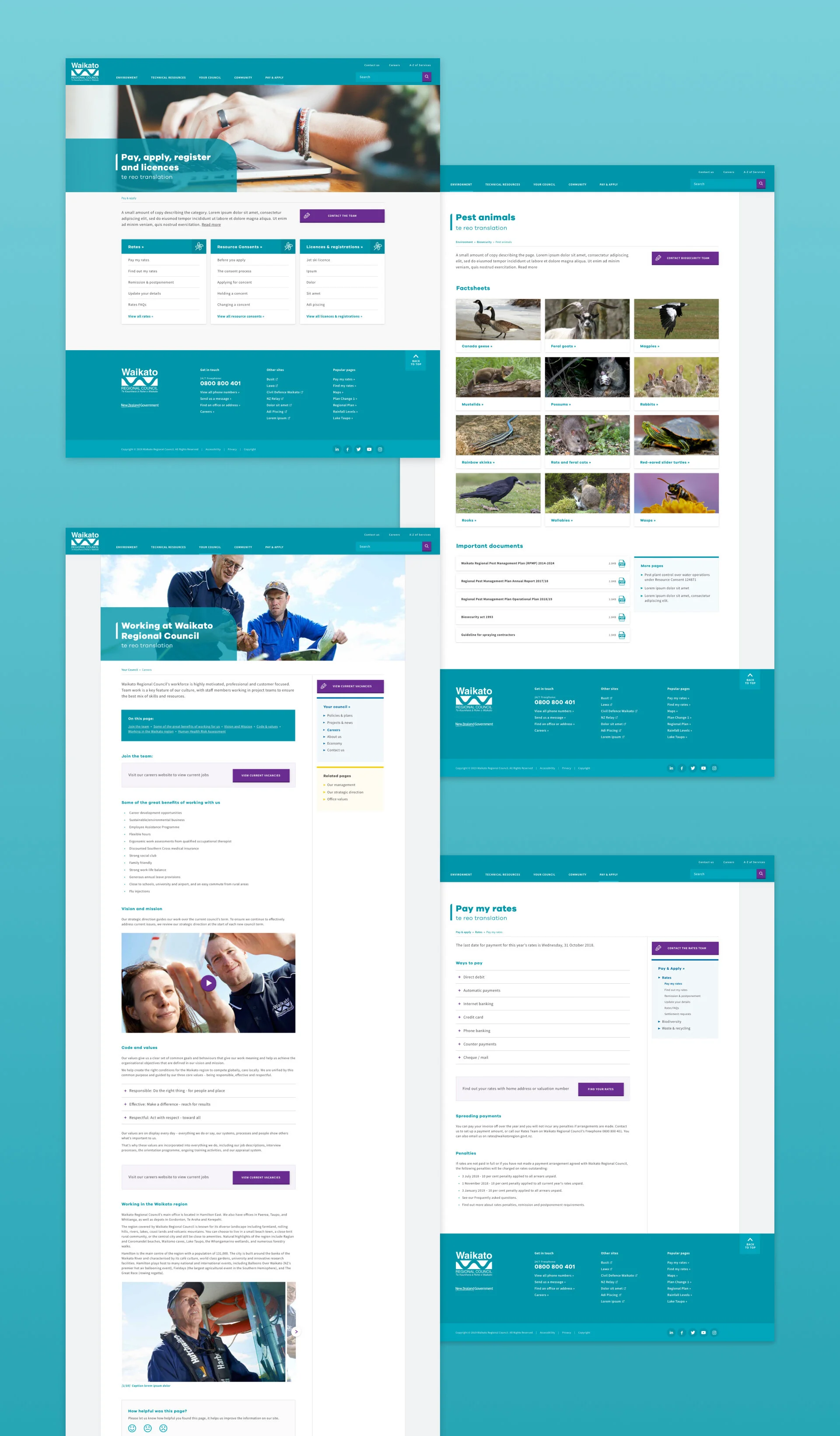
Designing a responsive pattern library that championed clarity, trustworthiness and accessibility – while sticking to strict brand guidelines. It had to be flexible enough to re-home the literally thousands of pages from the old website, as well as move into the future.